Donnelly's AS Blog.
A whole blog devoted to my A Level Coursework. I'm gonna be making magazines and all sorts. Yep. That's right. Bassett's Allsorts.
6. What Have You Learnt About Technologies From The Process of Constructing This Product?
Final Cut Pro X and iMovie
I didn’t actually use iMovie and Final Cut Pro X in my music magazine production, but I used them to create the movies that are in my evaluation.
They are really good pieces of software because they are really easy to use and I got used to their interface really fast. They enabled me to put subtitles and voiceovers, manipulate photos to zoom in and upload automatically to YouTube straight from the application.
Web Browsers
Web browsers are the reason we see anything online! The whole course centered on uploading our work to the Internet and allowing it to be seen by everyone and the web browser was the catalyst. I use Safari because I find it the easiest to use. And I was able to install it on the school computers but there are many others to use such as Opera, Mozilla Firefox and Google Chrome.
Blogger
Blogger is a powerful blogging tool that I used to present our work. I was able to be completely creative and because there were no real rules it allowed me to make the blog completely my own. I was able to place labels and make it like a real website so it was easy to navigate and professional.
DropBox
Dropbox is a great tool that eliminates the need for a USB stick, which I don’t actually have. Dropbox is cloud technology, where you can upload your work from any internet connected computer and download them to anywhere else via your internet browser.
SlideShare
SlideShare is an online tool which turns your PowerPoint presentation into an embed code that allows you to then upload and post it onto your blog or website instantly!
Dafont
DaFont is a website which hosts user created fonts. I find that using the default computer fonts can get really boring, so throughout my magazine cover, contents and double page spread I used lots of different fonts to keep my work original and cool.
Wordle
Wordle is a creative tool, which gives you a word splat. It is a time-saver when you’re trying to make a big word splat because doing it in Microsoft Word or any other application might take some time, you can also flick through randomly generated settings until you find the one you love.
Picasa Web Albums
Picasa Web Albums were a great help to me in being time efficient and keeping on top of my previously uploaded work. On my preliminary project I struggled to keep track of photo’s I had already uploaded and Picasa Web Albums helped me out. From blogger I could upload a photo quickly from Picasa and it also gave me a way of putting a slideshow of my previous pictures onto my blog.
Microsoft Word and PowerPoint
Microsoft Word and PowerPoint are very obvious programs and powerful if you know how to use them. I used PowerPoint to create presentations to put on my blog. Microsoft Word is also a great tool for creating spider diagrams and just typing up notes and drafts. I used it to do all of these and even presenting and arranging photographs.
Fireworks and Photoshop
Probably the programs I used the most. Photoshop is one of the most well known photo editing tools around the world. I used it to correct and edit photos the way I want them before importing them into Fireworks. I have been using Fireworks for about 3 years. I have become quite skilled in using it’s features and felt comfortable in creating my magazine cover.
Camera and SD card
My camera was one of my favourite pieces of technology to use. I have been using my camera since I began my first Media Course in year 9. It gives a great advantage in the creation process because it has a setting, which practically gives a perfect picture every time. The SD card that is used inside it gives you the ability to move your perfect photos from camera to computer in a matter of seconds.
Survey Monkey
Survey Monkey proved to be a highly powerful online tool, especially when it’s coupled with the fact that it’s free of charge. Writing a survey and printing it off on 20 pieces of paper and handing it to the people around can be time consuming, and environmentally devastating (especially if that’s 20 each for 12 people in the class). On top of that we have to collate the results ourselves. Survey Monkey has put an end to this. You can post it to any website, like Facebook or Twitter. Ask people to follow a link via e-mail or print it off and enter results manually for them to make graphs and statistics for you! Thank you Survey Monkey.
YouTube
YouTube is a fun website to watch all sorts of videos, but in terms of work it is a sound investment. When a Blogger upload failed me an embedded video from YouTube was just what I needed. You can upload your videos in minutes for the whole world to see. I was thankful to YouTube because it meant that my evaluation could go smoothly.
7. Looking Back At Your Preliminary Task, What Do You Feel You Have Learnt In The Progression From It To Full Product


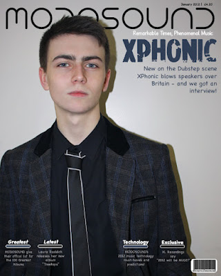
The biggest thing I learnt from preliminary task to the finished music magazine product was editing. Instead of taking a photo and editing the background out in order to make it clean and reducing the noise I learnt that it’s better to take a photograph properly the first time to remove unnecessary editing – because it can very time consuming.
One of the things I done on both and that I kept throughout was to layer the main image above the masthead – because it’s a convention.
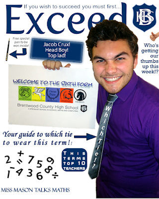
I done this better on my second time than on Jacob for my preliminary task.
I used a white background in the first but I feel this left it looking overly edited and fake. Instead in the main project I kept one picture as a whole and cleaned up any unclean marks in the background on Fireworks.
I reduced the amount of cover lines that filled the page. By leaving the cover lines at the bottom it made it easier on the eye and gave it more visual appeal because that way you can enjoy the photograph more. I aimed to be as professional as possible and making a magazine cover which had a single person to draw focus was a convention I found on lots of magazines and one I personally loved. Because my magazine was for older people and older students I reduced the amount of colour and use of arrows and I didn’t use a speech bubble for the Editor’s note. I believe that on my music magazine I filled the contents page more effectively and more realistically. In terms of finishing touches, this time I included a barcode, price and date.
Subscribe to:
Comments (Atom)


