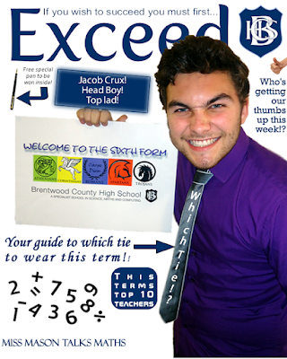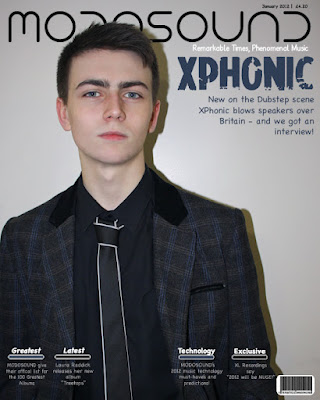

The biggest thing I learnt from preliminary task to the finished music magazine product was editing. Instead of taking a photo and editing the background out in order to make it clean and reducing the noise I learnt that it’s better to take a photograph properly the first time to remove unnecessary editing – because it can very time consuming.
One of the things I done on both and that I kept throughout was to layer the main image above the masthead – because it’s a convention.
I done this better on my second time than on Jacob for my preliminary task.
I used a white background in the first but I feel this left it looking overly edited and fake. Instead in the main project I kept one picture as a whole and cleaned up any unclean marks in the background on Fireworks.
I reduced the amount of cover lines that filled the page. By leaving the cover lines at the bottom it made it easier on the eye and gave it more visual appeal because that way you can enjoy the photograph more. I aimed to be as professional as possible and making a magazine cover which had a single person to draw focus was a convention I found on lots of magazines and one I personally loved. Because my magazine was for older people and older students I reduced the amount of colour and use of arrows and I didn’t use a speech bubble for the Editor’s note. I believe that on my music magazine I filled the contents page more effectively and more realistically. In terms of finishing touches, this time I included a barcode, price and date.

